The retail giant Walmart has decided to update its image after nearly two decades without significant changes, introducing a redesign of its logo. According to the company, this redesign of Walmart’s logo represents a visual evolution that seeks to reflect its transformation into a technology-driven omnichannel retailer while staying true to its roots and core values.
Why did Walmart decide to redesign its logo in 2025?
From its beginnings in Bentonville, Arkansas, in 1951, Walmart has grown from a small store into a global leader. The decision to redesign its logo reflects the company’s growth and its focus on staying relevant in an ever-evolving market.
Specifically, the redesign responds to the need to adapt to the expectations of an increasingly digital and demanding customer base while reinforcing values of accessibility, modernity, and emotional connection.
ALSO READ: Starbucks kicks off 2025 with a new Mission and Values: How does this impact its marketing strategy?

What changes does Walmart’s new logo bring?
The redesign of Walmart’s logo includes subtle yet significant modifications that strike a balance between tradition and innovation:
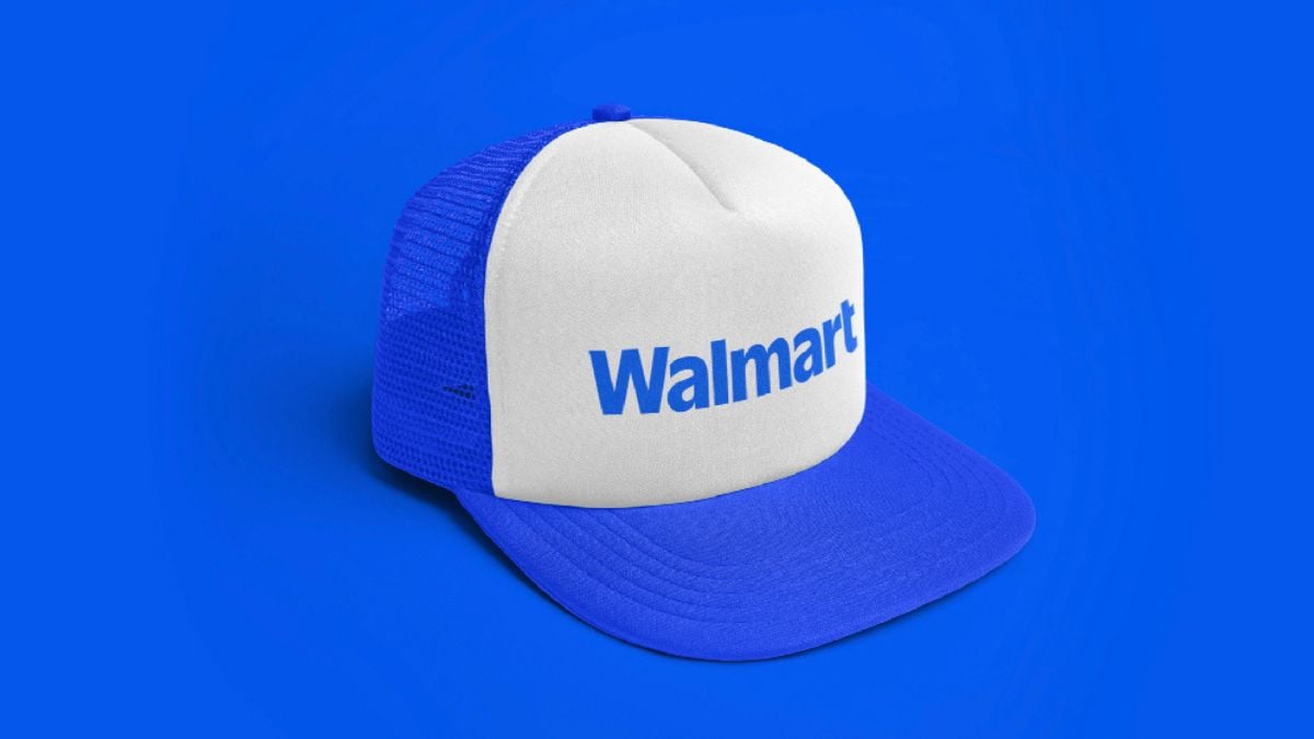
- Modern and custom typography: Inspired by Sam Walton’s classic trucker hat, the new typeface, called “Everyday Sans,” is a custom design based on the Antique Olive font used by Walmart during the 1980s and 2000s. This change not only modernizes the brand but also connects it with its history.
- The iconic “spark”: The yellow symbol representing Walmart’s energy remains, but it now takes center stage as an independent element. This move positions it as a universal symbol, similar to Target’s bullseye or Amazon’s smile.
- Renewed color palette: The darker blue, called “True Blue,” and the vibrant yellow “Spark Yellow” give the logo a fresh and modern look while maintaining a connection to the brand’s historical colors.
What is Walmart aiming for with this update to its visual identity?
The primary goal of the redesign of Walmart’s logo is to align with its evolution into an omnichannel retailer that combines the best of physical and digital commerce. David Hartman, Walmart’s Vice President of Creative Design, explains it clearly in an interview with MarketingDive: “It’s not a total reinvention of Walmart’s identity. It’s more of an evolution, not a revolution.”
The update not only seeks to modernize Walmart’s image but also to establish it as a relevant brand in a digital world. According to Hartman, this change will help Walmart position itself as an omnichannel retailer capable of serving customers wherever and however they wish to interact with the brand.

Technology as a key factor in Walmart’s redesign
The emphasis on digital is crucial to understanding the new Walmart logo. With the launch of Walmart+ in 2020 and an increased focus on e-commerce, the brand has strengthened its digital presence. In the third quarter of fiscal year 2025, Walmart’s online sales in the U.S. grew by 22%. This growth has been instrumental in driving the update to its visual identity, demonstrating a commitment to technological innovation.
“The new logo reflects our digital capabilities and our intention to be an inspirational retailer, providing customers with what they need, when they need it,” stated William White in a press release.

How will Walmart’s logo redesign be implemented?
The rollout of Walmart’s new logo began in October 2024 at its experimental Store 4108 in Springdale, Arkansas. This store has served as a testing ground for changes, including illustrated murals and visual elements that enhance the customer experience. The results have been positive: according to Hartman, customers describe the store as warmer and more inviting when they enter.
The logo update will gradually reach Walmart’s more than 10,500 stores in 19 countries, as well as its website, app, and marketing campaigns, officially launching in January 2025.
What does Walmart’s new logo mean for the future of the brand?
This redesign is much more than an aesthetic change. It represents Walmart’s intention to evolve alongside its customers and the global market. From attracting higher-income shoppers to expanding its digital reach, the new Walmart logo symbolizes a continuous commitment to accessibility, innovation, and sustainability.
With this update, Walmart seeks to reinforce its position as a global leader in retail, proving that innovation and tradition can go hand in hand.

The new Walmart logo in 5 key details
1. Changes to the background color
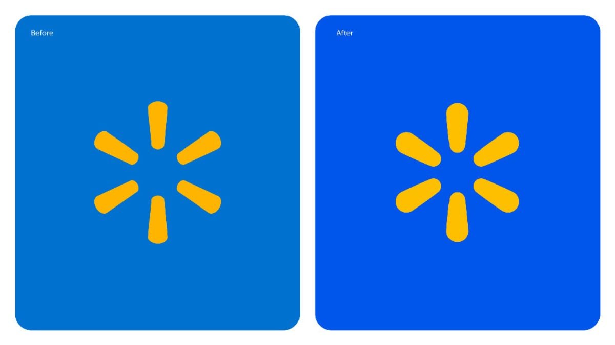
- Before: The background featured a light blue tone that conveyed calm, friendliness, and accessibility, aligning with Walmart’s traditional positioning as a welcoming and family-oriented brand.
- After: A deeper blue has been adopted, giving an impression of modernity, confidence, and energy. This change reinforces the idea that Walmart is evolving toward a more contemporary and technologically advanced approach, highlighting its transformation into a leading digital retailer.
2. The “Spark”
- The central icon, known as the “Spark,” remains unchanged in shape and color, retaining its vibrant yellow. This element continues to be the brand’s distinctive symbol, associated with energy, optimism, and guidance.
- The contrast between yellow and the new blue makes the “Spark” stand out even more, symbolizing Walmart’s mission to be a beacon of accessible solutions for its customers.
3. Color palette
- The combination of “True Blue” and “Spark Yellow” colors remains true to Walmart’s core values, but now projects a more professional and dynamic image. This change also highlights the brand’s heritage while positioning it as a modern option in the competitive omnichannel market.
4. Symbolism
- Visual consistency: The “Spark” continues to convey the idea of inclusion and diversity, reflecting the breadth of Walmart’s offerings and its focus on accessibility for all.
- Brand evolution: The use of a deeper and more vibrant color communicates Walmart’s evolution into a technology-driven retail leader while maintaining its legacy of low prices and customer service.
5. Visual impact
- The color change creates a more attractive and contemporary visual effect, capturing attention and reflecting Walmart’s strategic direction as a culturally relevant and digitally advanced brand.


